
Color, Pattern, Texture: The Three Levers of Every Well-Decorated Room
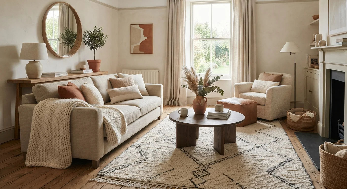
Photo credit: InGlimpse.com | Where Curiosity Finds Answers
In this article
Every design decision in a room pulls on color, pattern, or texture. Understand how these three elements interact and you can decorate any space with confidence.
Key Takeaways
- Color sets the emotional tone of a room before anything else is noticed.
- Pattern directs the eye and creates visual rhythm — even one pattern can anchor a space.
- Texture adds physical and perceived depth, making a room feel layered rather than flat.
- Balancing all three prevents a room from feeling either sterile or chaotic.
- You don't need to overhaul a space — adjusting one lever can transform a room's feel.
Why These Three Elements Run Everything
Strip any well-decorated room down to its bones and you'll find the same trio doing the heavy lifting: color, pattern, and texture. Every curtain, cushion, rug, and wall finish is a decision about one or more of these elements. Understanding how they work — individually and together — is the practical foundation of decorating with confidence.
This isn't a rule system that limits creativity. It's a framework that explains why some rooms feel immediately right and others feel slightly off, even when you can't name the problem. Once you know what to look for, you can diagnose issues and fix them without starting over.
For a closer look at how perception shapes room feel, see why some rooms feel off-balance even when they're tidy.
90 sec
Time for color to influence mood perception
Research in environmental psychology suggests color influences emotional response within roughly 90 seconds of entering a space.
60–30–10
Classic color proportion guideline used by designers
This ratio — dominant, secondary, accent — is a widely referenced starting point among interior design practitioners for distributing color in a room.
3+
Texture types recommended for a layered room feel
Design educators generally suggest using at least three distinct surface textures in a room to avoid visual flatness, particularly in neutral-palette spaces.
Color: The Mood-Setter
Color is the first thing the brain registers in any space. Before you process furniture arrangement or fabric choice, you've already formed an emotional response to the dominant hues in a room. That's why getting color right is so consequential — and why common color myths like "dark walls shrink a room" persist even when evidence says otherwise.
Hue, Value, and Saturation
Color has three properties that matter in practice:
- Hue — the actual color family (blue, green, red)
- Value — how light or dark that color is
- Saturation — how vivid or muted the color appears
Most decorating mistakes happen at the saturation level, not the hue level. A highly saturated cobalt blue can feel aggressive in a bedroom; a muted dusty blue in the same hue reads as restful. Choosing colors in their muted or toned-down versions is one of the most reliable ways to create a cohesive look across multiple surfaces.
The 60-30-10 Starting Point
A well-used rough guideline is to distribute color across a room in approximate proportions: 60% a dominant color (walls, large upholstery), 30% a secondary color (curtains, accent chairs), and 10% an accent (cushions, art, small objects). This isn't a rigid formula, but it provides a useful check when a room feels visually noisy — often the culprit is an imbalance in these proportions.
Lighting changes color significantly. A paint chip that looks warm in a hardware store may read cool on a north-facing wall. Always evaluate color samples in the actual room, at different times of day. For more on this interaction, see how light shapes room color.
Test paint colors as large swatches — at least 12 inches square — and observe them at morning, afternoon, and evening light before committing. A 2-inch chip is nearly useless for predicting how a color will read on a full wall.
Color perception shifts significantly under different lighting conditions; a swatch tested only in one light will frequently disappoint once applied at scale.
When mixing patterns, use the 'squint test': step back and squint at the room. If one pattern visually jumps forward and overwhelms the others, it's too dominant in scale or saturation relative to the rest.
Reducing detail by squinting isolates overall visual weight and contrast, making imbalances in pattern competition much easier to spot before purchasing.
Pattern: The Eye-Mover
Pattern gives a room visual rhythm. It tells the eye where to travel and creates points of interest that make a space feel considered rather than generic. A room without any pattern often feels flat, even when the colors are beautiful and the furniture is well-chosen.
Scale Is Everything in Pattern
The same floral motif can look elegant at a large scale on drapery and fussy at a small scale on a scattered cushion. Pattern scale should relate to the surface it's on and the room's overall dimensions. Large-scale patterns work on large surfaces — rugs, statement chairs, wallpaper. Small-scale patterns work best as accents, not as the primary pattern in a room. For a deeper explanation of scale in decor, interior designers' take on scale is worth reading.
Mixing Patterns Without Creating Chaos
Mixing patterns is more approachable than most people assume. The key variables to manage are:
- Vary the scale — combine a large geometric with a smaller floral, not two bold florals of similar size
- Keep a common color — patterns that share even one color from the room's palette tend to feel intentional rather than accidental
- Use solid breathing room — solid-colored surfaces between patterns let each one register without competing
Start with One Anchor Pattern
If you're new to mixing patterns, commit to one bold anchor pattern — typically on the rug or main upholstered piece — and keep everything else solid or subtly textured. You can always add a second supporting pattern once the anchor feels settled. This approach prevents the most common mixing mistake: too many patterns competing at similar scales.
Texture: The Dimension-Builder
Texture is the element most often overlooked — and the one that most distinguishes a room that photographs well from one that actually feels good to be in. Texture operates on two levels: tactile (how a surface feels to the touch) and visual (how a surface appears to have depth or roughness, even from a distance).
Why Texture Matters in Neutral Rooms
In rooms with restrained color palettes, texture carries the design weight. A room furnished entirely in cream and white will feel clinical without variation in surface texture — linen vs. velvet, smooth plaster vs. natural wood grain, matte ceramic vs. polished stone. Introducing contrast in texture keeps a neutral palette from reading as unfinished.
Texture Through Everyday Objects
You don't need an expensive renovation to add texture. Consider:
- Woven baskets or rattan storage pieces
- A chunky knit or bouclé throw on a sofa
- Exposed wood on a coffee table or shelf bracket
- Layered rugs (a flat-weave under a higher-pile rug)
- Linen or cotton curtains instead of synthetic fabric
Even small shifts — swapping a glass vase for a ceramic one — create texture contrast that registers visually. Use the room-by-room decor refresh checklist to spot where texture is missing in your own spaces.
Too Much Texture Can Feel Cluttered
Texture contrast is valuable, but every surface being highly tactile — rough, chunky, or heavily woven — can make a room feel overwhelming rather than layered. Aim for contrast between textures: pair a smooth surface with a rough one, a matte finish next to a slightly reflective one. Smooth surfaces give the eye a resting point and make the textured elements read more clearly.
How to Use All Three Together
The three elements aren't independent switches. They interact constantly, and adjusting one affects how the others read. Here's a practical approach to working with all three:
- Anchor with color first. Decide on your dominant color and its value before selecting patterns or textured materials. This prevents you from falling in love with a pattern in isolation, only to find it clashes with the walls once installed.
- Introduce one primary pattern. Choose a single pattern to lead — often on the largest soft surface in the room (a rug or main sofa fabric). Everything else should either be a supporting pattern at a different scale, or solid.
- Layer texture last. Once color and pattern are set, evaluate where the room feels flat or monotone. Add texture through accessories, soft goods, and surface finishes to address those spots specifically.
This sequence isn't the only valid approach, but it prevents the most common outcome: rooms that feel either too busy (competing patterns in similar scales) or too flat (cohesive color with no tactile variation).
“Decorating is not about making a showcase home; it's about creating a comfortable and beautiful place to live. The three elements that make a room work — color, pattern, and texture — are the tools that let you do exactly that.”
— Albert Hadley, Influential American interior designer and design educator
Common Mistakes and How to Avoid Them
Even with a clear framework, a few predictable errors derail otherwise good rooms. Knowing what to watch for can save a significant amount of rework.
Matching Instead of Coordinating
A common instinct is to match — buying the sofa, curtains, and rug from the same product line or in the same exact color. Matching flattens a room. Coordinating — choosing pieces that share color family, value, or texture characteristics without being identical — creates rooms that feel collected and intentional. The difference between the two is the difference between a room that looks designed and one that looks packaged.
Ignoring Texture in Favor of Color
When a room feels dull, many people reach for more color rather than more texture. Often the issue is a lack of surface variation, not a lack of hue. Before adding a new paint color or a bolder pillow, audit the room for texture variety first.
Overcommitting to a Single Pattern
Repeating the same pattern across multiple surfaces — same geometric on the rug, the curtains, and the throw pillows — removes visual rhythm. Pattern needs contrast to breathe. Vary the motif type and scale, even within the same color palette. This principle applies to wardrobe choices too; see how statement pieces and neutrals balance in personal style for a parallel concept.
Test Before You Commit
Color, pattern, and texture all look different in situ than they do in a store, on a screen, or in a catalog. Before making large purchases — rugs, upholstered furniture, wallpaper — bring samples into the actual room and live with them for at least a few days. What works in isolation often behaves differently when surrounded by your existing walls, flooring, and light sources.
Understanding these three levers doesn't require design training — it requires attention. Walk into any room you find appealing and ask yourself which colors are dominant, where the patterns live, and what textures are present. That habit of observation will sharpen your decorating instincts faster than any style guide.
Room-by-Room Decor Refresh Checklist
A structured checklist for auditing each room in your home to identify where color, pattern, or texture adjustments would make the biggest visual difference.
Visual Weight Principle Guide
Explains why rooms can feel off-balance even when tidy, and how to identify and correct the imbalance using decor placement and element distribution.
Understanding Scale in Interior Design
Breaks down what scale means in decor practice — how the size of furniture, patterns, and objects relative to each other affects the feel of a room.

Author
Home Editorial Team
Home Editorial Team is the collective byline for our editorial team and contributor network. Articles published under this byline or an editorial pen name are researched, written, and reviewed according to our editorial standards for clarity, consistency, and independence before publication.
View all articles →