
The Visual Weight Principle: Why Some Rooms Feel Off-Balance
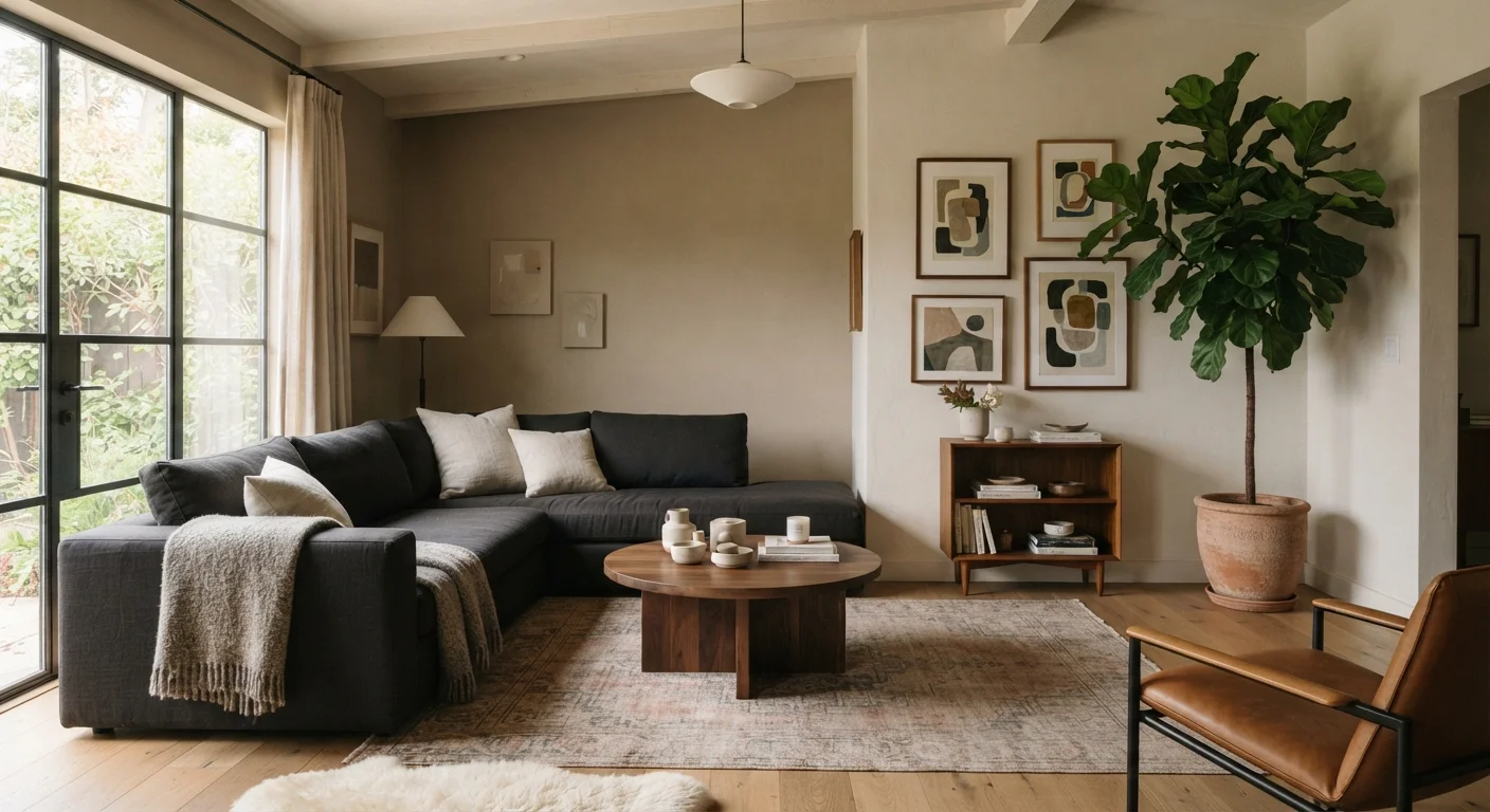
Photo credit: InGlimpse.com | Where Curiosity Finds Answers
In this article
Visual weight explains why a room can feel lopsided even when it's tidy. Learn how to identify and correct imbalance in any space.
Key Takeaways
- Visual weight is perceived heaviness, not physical weight — color, size, texture, and pattern all contribute.
- A room feels off-balance when visual weight clusters in one area rather than distributing across the space.
- Dark colors and bold patterns carry more visual weight than light, neutral tones.
- Asymmetrical balance is just as effective as symmetry — it just requires more deliberate placement.
- Small adjustments like repositioning a lamp or swapping a rug can meaningfully shift a room's balance.
What Visual Weight Actually Means
Stand in any room and look around. Chances are your eye travels immediately to certain spots — a large dark bookcase, a bold-patterned rug, a gallery wall dense with frames. Those are the heaviest points in the room visually, regardless of what a scale would say.
Visual weight describes how much presence an object commands in a space. It is shaped by four main factors: size (larger objects carry more weight), color (darker hues feel denser and more grounded), texture (rough or layered surfaces read as heavier than smooth ones), and pattern (busy or high-contrast patterns attract and hold the eye).
Understanding this concept is foundational to decor decisions. As our guide to scale in interior design explains, professionals think carefully about these invisible visual forces even before choosing a paint color.
Visual Weight Is Perceived, Not Measured
Two people may perceive the same room slightly differently based on their visual processing and cultural context. There are no universal rules with hard numerical cutoffs — these principles are guidelines, not formulas. Trust your eye, and don't be afraid to experiment by moving objects around before committing to permanent changes.
Why Rooms Feel Off-Balance
A room typically feels lopsided when visual weight accumulates in one zone while another zone sits comparatively empty. This creates tension — the eye keeps snapping back to the heavy side, and the lighter side feels neglected or incomplete.
Common culprits include:
- All large furniture pushed against one wall
- A single oversized piece with nothing on the opposite side to respond to it
- A dark accent wall with no other dark tones elsewhere in the room to anchor it
- Artwork or shelving clustered above one seating area with bare walls throughout
The fix is rarely about buying new furniture. Most imbalances can be corrected by redistribution — moving a floor lamp, adding a tall plant, or hanging artwork lower to shift the visual center of gravity. The room-by-room decor refresh checklist is a practical tool for auditing exactly these kinds of visual gaps.
60–30–10
Classic color distribution rule used by designers
The 60-30-10 guideline — dominant color, secondary color, accent — is widely referenced in interior design education as a framework for distributing visual weight through color.
3×
Number of placements recommended to anchor a tone
Design educators commonly advise repeating a bold color or texture in at least three locations around a room so no single item carries disproportionate visual weight.
How Color, Pattern, and Texture Carry Weight
Of all the factors shaping visual weight, color is the most powerful lever. A deep navy sofa carries far more visual weight than a cream one of the same dimensions. This is why designers often recommend distributing dark tones around a room — a dark sofa, a dark side table across the room, and a dark-framed mirror — so the eye has multiple resting points rather than one dominant anchor.
Pattern works similarly. A boldly patterned throw pillow reads as heavier than a solid one. Placing all your pattern in one corner creates an imbalance even when the furniture itself is evenly placed.
Texture is the subtler variable but no less important. A woven wall hanging, a stacked-stone fireplace surround, or a shaggy area rug all add visual mass without adding color. This makes texture especially useful for adding weight to a pale or sparse area without disrupting a neutral color scheme. See how color, pattern, and texture interact for a deeper look at each lever.
The Squint Test for Quick Balance Checks
A quick way to assess visual weight distribution: stand in the doorway of the room and squint until the details blur. The areas that appear darkest or densest are your heaviest visual anchors. If they all cluster in one zone, that's where imbalance is occurring. This technique strips away detail and lets you see the room's weight map at a glance.
Practical Ways to Rebalance Any Room
Once you can identify where visual weight is pooling, the adjustments become intuitive. Here are approaches that work in most spaces:
- Add visual weight to the light side. A tall plant, a floor lamp with a dark shade, or a large framed print can anchor a sparse corner without permanent changes.
- Break up a heavy cluster. If one wall holds all the art, redistribute a piece or two. Spreading visual anchors around the room pulls the eye on a more satisfying journey.
- Use color echoing. Repeat a dark or bold tone in at least two to three places around the room so no single piece dominates.
- Consider vertical distribution. Balance isn't only horizontal. A room where all items sit at the same height can feel flat; mixing low furniture with taller elements creates a more layered, dynamic composition.
These principles apply in compact spaces too — in fact, visual weight is often what separates a small room that feels intentional from one that feels chaotic. Our small living room decorating guide covers how to apply these ideas when space is tight.
Frequently Asked Questions

Author
Home Editorial Team
Home Editorial Team is the collective byline for our editorial team and contributor network. Articles published under this byline or an editorial pen name are researched, written, and reviewed according to our editorial standards for clarity, consistency, and independence before publication.
View all articles →