
Color Coordination Basics Every Everyday Dresser Should Know
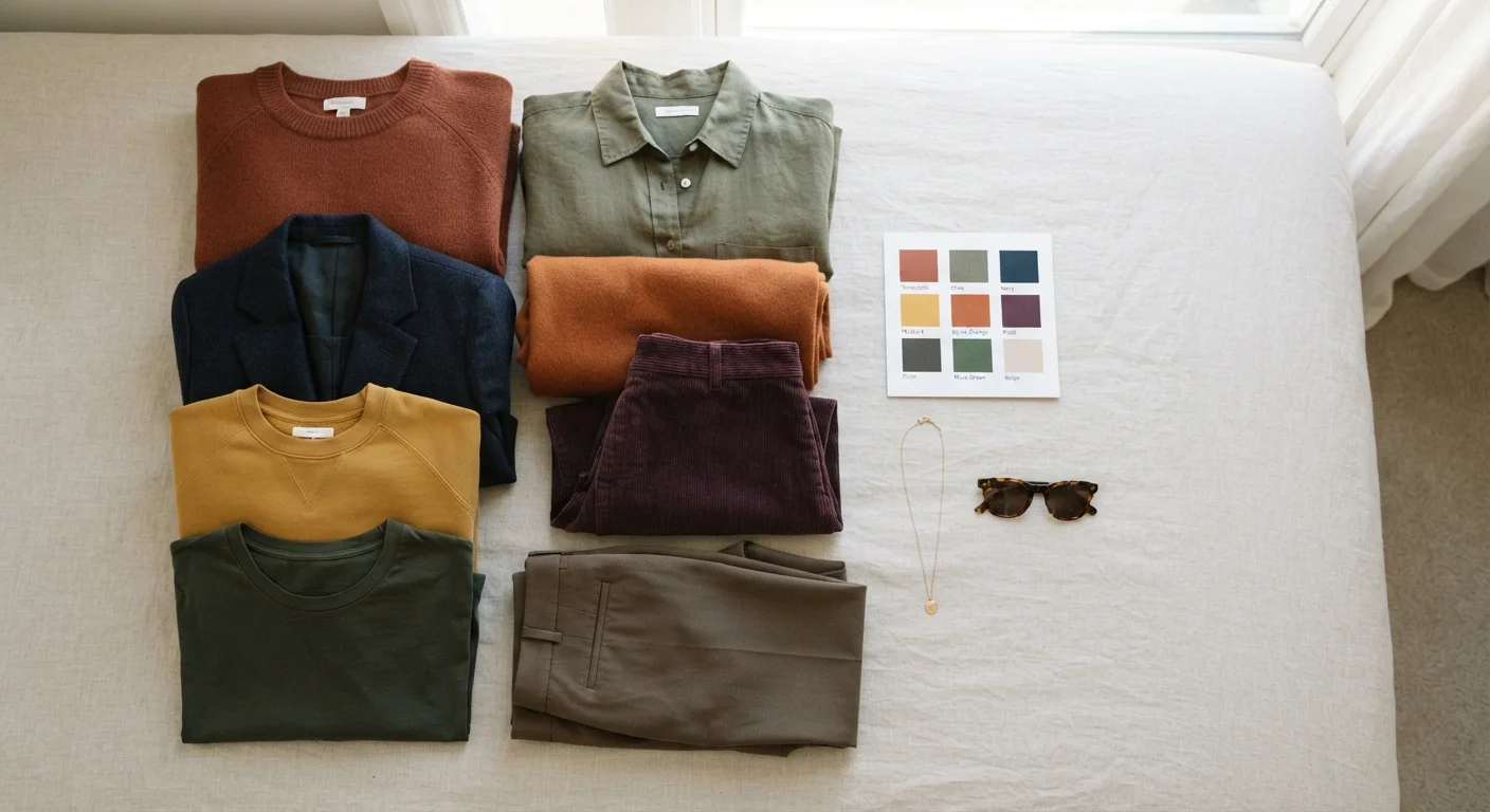
Photo credit: InGlimpse.com | Where Curiosity Finds Answers
In this article
You don't need a design degree to combine colors well. These foundational principles explain how hue, tone, and contrast work in real everyday outfits.
Key Takeaways
- The color wheel's core relationships — complementary, analogous, and triadic — apply directly to everyday outfit building.
- Tone and saturation matter as much as hue; mixing the same tone level creates natural-looking harmony.
- Neutrals act as anchor points that let bolder colors coexist without clashing.
- Skin undertone awareness helps you choose colors that enhance rather than drain your complexion.
- A simple rule of three — one dominant, one secondary, one accent — keeps most outfits balanced.
Why Color Coordination Feels Hard (and Why It Doesn't Have to Be)
Most people who struggle with color aren't making dramatic mistakes — they're missing a small number of foundational concepts that clarify nearly every decision. Once you understand how colors relate to each other structurally, choices that once felt arbitrary start to make logical sense.
Color coordination in fashion follows the same principles used in interior design and graphic arts, adapted to the scale of an outfit. If you've ever wondered why certain combinations feel effortlessly pulled-together while others look off, the answer usually lies in three variables: hue (the color itself), tone (how light or dark it is), and saturation (how vivid or muted it appears). Understanding these three dimensions is the real foundation. For a broader look at how color interacts with pattern and texture in a design context, see our piece on how these three design levers interact.
These Are Principles, Not Rules
Color coordination guidelines are descriptive, not prescriptive. They explain why certain combinations tend to work — but personal style, cultural context, and individual preference all legitimately override them. Use these principles as a starting framework, not a rulebook you're obligated to follow exactly.
The Core Color Relationships You Should Know
The color wheel isn't just an art-class tool — it's a practical map for outfit building. Three relationships are worth knowing:
- Complementary: Colors directly opposite on the wheel (navy and burnt orange, for example) create strong visual contrast. Used well, they're striking; used carelessly, they compete.
- Analogous: Colors that sit adjacent on the wheel (olive, sage, and mustard) blend naturally because they share underlying hues. This is often the easiest approach for beginners.
- Triadic: Three colors evenly spaced around the wheel. More complex, but effective when one color dominates and the others appear in smaller doses.
In practice, analogous combinations work well for everyday casual dressing, while a well-managed complementary pairing can anchor a more intentional look. Once you're building a deliberate wardrobe around these principles, starting a capsule wardrobe is a natural next step.
Tone, Saturation, and the Rule of Three
Hue alone doesn't determine whether an outfit works. Two colors can share the same wheel relationship and still clash if their tones are mismatched. Mixing a bright, saturated red with a washed-out dusty blue creates visual tension not because the hues conflict, but because the energy levels do. A useful habit: choose colors that occupy a similar saturation range — all muted, all rich, or all soft — unless you're deliberately using contrast for effect.
The rule of three is one of the most practical frameworks in everyday dressing. Structure your outfit around one dominant color (roughly 60% of the visual surface), one secondary color (about 30%), and one accent (10% or less). This proportion prevents any single element from overwhelming the look while giving the eye a clear focal point.
If your wardrobe often feels disconnected, the issue may run deeper than color — why outfits feel incoherent covers the most common structural problems.
Neutrals, Skin Undertone, and Building Confidence Over Time
Neutrals — black, white, grey, navy, camel, cream — are the connective tissue of most functional wardrobes. They don't compete for attention, which means they can anchor combinations that would otherwise feel unstable. Think of neutrals as the volume knob: they turn down the intensity of any palette without eliminating it. For more on balancing neutrals against bolder pieces, see neutrals versus statement pieces.
Skin undertone — whether your complexion runs warm (yellow, peachy, golden), cool (pink, red, bluish), or neutral — influences which colors sit well near your face. Warm undertones often harmonize with earthy, amber, and warm-based hues; cool undertones tend to work well with jewel tones, true whites, and cooler greens and blues. This isn't a rigid rule, but it's a useful filter when you're choosing between two options.
Color fluency builds gradually. Start by mastering one reliable combination — a go-to analogous grouping or a neutral anchor with one consistent accent — then expand from there. The goal isn't a perfect outfit every day; it's developing an eye that makes decisions faster and with more confidence. The essentials for everyday American casual dressing are worth knowing as you build that foundation.

Author
Style Editorial Team
Style Editorial Team is the collective byline for our editorial team and contributor network. Articles published under this byline or an editorial pen name are researched, written, and reviewed according to our editorial standards for clarity, consistency, and independence before publication.
View all articles →