
Why Decorating Rooms in Isolation Almost Always Backfires
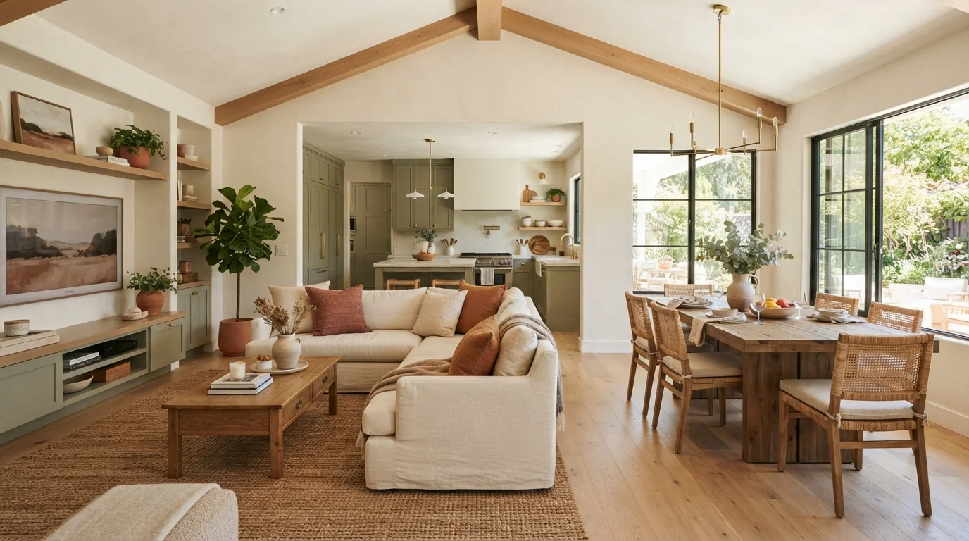
Photo credit: InGlimpse.com | Where Curiosity Finds Answers
In this article
Treating each room as a separate project is one of the most common decor pitfalls. Here's how to think about your home as a connected whole.
Key Takeaways
- Decorating each room without considering adjacent spaces creates visual discord that feels unsettling.
- A shared color palette, material, or repeating element is the simplest way to create whole-home cohesion.
- Most isolation mistakes happen at the planning stage, before a single item is purchased or hung.
- Sightlines matter: what you see from a doorway or hallway should inform every room's decisions.
- Consistency doesn't mean uniformity — variation within a framework keeps spaces interesting.
The Problem With Thinking Room by Room
Most people decorate the way they clean: one room at a time, door closed, full focus on what's inside. It feels organized, but it routinely produces homes that look disjointed — a coastal bedroom next to a maximalist living room, or a cool-grey kitchen that clashes with a warm-toned hallway just three feet away.
The root issue is that homes are experienced as sequences of connected spaces, not isolated boxes. When you walk through a front door, you rarely see just one room. Sightlines carry your eye through doorways, down corridors, and across open-plan layouts. Decisions made in isolation show up as friction the moment someone moves through the space.
This doesn't mean every room must look identical. It means they need a shared visual language — a repeating color, material finish, or tonal range that signals they belong to the same home. Without that thread, even individually well-decorated rooms can feel like they were furnished by different people. For a closer look at how deeply-held decor assumptions can steer you wrong, see common decorating myths worth reconsidering.
Common Mistakes That Isolate Rooms From Each Other
Choosing each room's paint color independently, without referencing adjacent spaces.
Why it happens: Paint decisions often happen at the hardware store, room by room, without swatches from neighboring rooms on hand. Each color looks fine in isolation under the store's lighting.
Buying furniture scaled and styled for a single room without considering how it reads from connected spaces.
Why it happens: Shoppers naturally picture a piece in the room it's intended for, not in the context of a whole home. An oversized sectional or a very ornate dining set may look proportional in isolation but feel out of place at a glance from the hallway.
Using entirely different material finishes — metals, wood tones, hardware — in each room.
Why it happens: Trends shift, rooms are decorated years apart, and it's easy to move toward whatever looks current at the time of each project. The result is brushed brass in one room, matte black in another, and chrome in a third.
Ignoring the visual impact of doorways and hallways as transitional spaces.
Why it happens: Hallways and entryways are often treated as afterthoughts — purely functional spaces that don't need decorating attention. But they're the frames through which every adjacent room is viewed.
Decorating feature walls — accent walls, gallery walls — without considering what's visible through nearby openings.
Why it happens: Feature walls are often planned as standalone moments. Designers focus on the wall itself and the room it occupies, not on how it interacts with what's visible just beyond the doorframe.
Once you recognize these patterns, they're hard to unsee — in your own home and in others. The good news is that most can be corrected without a full renovation or significant expense.
How to Build Cohesion Without Losing Each Room's Identity
Whole-home cohesion starts before you touch a single wall or buy a single piece of furniture. The practical move is to create a simple reference palette — two or three anchor colors and one or two material finishes that will recur throughout the home. These don't have to appear equally in every room; a color that dominates the living room might appear only as an accent in the bedroom. That repetition alone does most of the connective work.
~60%
of open-plan homes have visible sightlines between two or more rooms
Industry surveys of residential floor plans consistently show that the majority of modern homes have at least one area where multiple rooms are visible simultaneously, making cross-room cohesion a practical necessity rather than an aesthetic preference.
3–5
Recommended anchor colors for whole-home palette
Interior design educators generally advise limiting a home's dominant palette to three to five colors, repeated in varying proportions across rooms, to create visual continuity without monotony.
Flooring is one of the highest-impact cohesion tools because it's visible across multiple rooms simultaneously. Consistent or complementary flooring throughout open-plan areas eliminates one of the most jarring transitions a home can have. Where flooring does change — say, tile in a bathroom — a shared grout tone or trim color can bridge the gap.
Textiles are another underused lever. A throw pillow in the living room that picks up the curtain color from the dining area, or a rug that echoes the bedroom's wall tone, creates quiet visual connections without demanding that rooms match. The layering textiles guide explains how to do this without rooms feeling cluttered or overly coordinated.
When you're working room by room — which is often a practical necessity given budget and time — use a mood board or even a simple photo folder that holds reference images for every space in the home. Before committing to anything for one room, check it against the reference for adjacent spaces. That five-minute habit catches most isolation errors before they become expensive ones.
Bold Accent Choices Need Extra Scrutiny
Dramatic decisions — a deep paint color, a patterned wallpaper, a statement light fixture — have the highest potential to create conflict with adjacent spaces. Before committing to anything bold, check it against the palette and materials already present in every room that shares a sightline. What looks striking in isolation can look chaotic once doors are open and rooms are experienced together. Understanding accent wall options can help you weigh the trade-offs before committing.
For renters, the same principles apply even when structural changes are off the table. Renter-friendly decorating approaches show how to build cohesion through furniture, textiles, and removable accents rather than paint or permanent fixtures.

Author
Home Editorial Team
Home Editorial Team is the collective byline for our editorial team and contributor network. Articles published under this byline or an editorial pen name are researched, written, and reviewed according to our editorial standards for clarity, consistency, and independence before publication.
View all articles →